Tuesday 1 May 2012

Evaluating the video

The animation video is completed. I really enjoyed making the work and it showed me skills that I can really use in the future.

I really enjoyed using the animation tools and creating a piece of work that looked almost realistic. I much preferred it 2D animation using Flash.

I think the most effective technique in the animation is the use of the reactor tool. It provides a very realistic and interesting effect that the video can conclude at. I found the reactor tool quite confusing to use at first but I managed to understand the different control parameters such as the collateral tolerance and the rigid body collection. Once I understood these I was able to grasp how the reactor worked and implement it into the castle wall.


I found using the auto key and set key very easy and it allowed me to create movement very quickly.
Making the siege machine move was easy and changing the motion track to slow using the curve editor improved the effect a lot. I had a little trouble rotating the wheels at the same rate at what the machine moved but by rotating it manually I found that I could make it more life-like.

I thought the use of cameras really brought the work to life. I only used free cameras as I didn't want the work to target a particular component of the animation. By animating the cameras I managed to make interesting perspectives, such as the camera moving through the siege bridge. I think these obscure perspectives and movements gave a more fun and interesting way of showing the work.


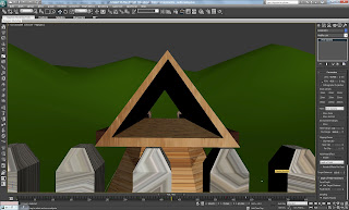
I think the materials made a lot of differece to the work. If I had more time I would like to add grass effect. In think this might add another level of realism to the work.

When I rendered out the work at HDTV 1280 x 720 I thought the level of clarity in the work would be better. When I edited the clips in Premiere I found that the quality didn't seem high definition but I felt that they were more than good enough to watch.

If I were to do the animation again I would render at a higher quality (either in 3DS Max or in Premiere) as I think this would make the work look more professional. I would like to create a more complex environment around the animation and add more detail to the background.

Overall I really enjoyed creating the work. I think it brings life to Da Vinci's work in an accurate way to what it would of done in real-life. I believe I have captured the works of Da Vinci and portrayed it in an interesting and fun way.


Monday 30 April 2012

Adding music

I felt the animation was good but was not complete without some sort of sound.

The first thing I did was find a cannon blast sound to place in at the best moment when the cannon fires.

I found the sound on 'Soundbible.com' and provides a life-like boom of a cannon.

I also found a life-like wall crashing down for when the cannon ball smashes the castle wall. This effect helps the animation seem more realistic.

The last effect was for a background track which leads the viewer throughout the video. I needed a dramatic and enjoyable theme that relates back to Da Vinci's time.

After listening to quite a few classical music tracks, I felt that they did not quite suit the video. Then I thought of Pirates of the Caribbean theme and thought the action/adventure music would fit well.


I had to edit the track to fit the time line and put the audio in the corresponding place in the video.

I then imported this edited track and added an exponential fade to the beginning and end to match the video.

I really think it works well and provides and appropriate backdrop to the video.

Using Adobe Premiere

To make the animation into into one file I had to put it into Adobe Premiere.

I am familiar with Premiere as I used it in previous projects. Once Premiere was opened I imported each rendered scene and organised them into the correct order in the timeline.

When I played the sequence some of the timings seemed unrealistic, as if you were waiting for the animation to catch up with you.

By cutting endings of clips and shifting the timeline along, it created a must more fluid video.

I felt like the animation needed an introduction. So I created a brief title screen that fades into the animation. I contained a title 'Da Vinci Siege Machine' and included my SID.

I also added video transition effects that linked each scene to one another and also starts and finishes the video. I think this makes the animation more professional and better to watch.

Rendering

It was important to use the correct rendering settings to optimise the animation and the way it looks.

I made sure I use a mental ray renderer which creates a better look for the finished animation as I have used mental ray shadows and light.

I used the HDTV setting to export the animation. The HDTV setting is set to 1280 x 720. This will give an optimal frame rate and ratio setting that would be great for widescreen TV's otherwise the animation will look old in an 4:3 ratio.

In some scenes the green plane seem to illuminate the other shapes such as the wall. To overcome this problem I reduced the final gather from 1.0 to 0.3. This gave a much more realistic effect and didn't make the grass look radioactive!

The rendering took longer than I thought as Scene 1 took almost 3 hours. The others scenes had considerably less frames and therefore took less time.

I was glad I did not use fur or grass effect on my animation as it considerably increased the rendering time for my friends who did. I didn't think it added much to the animation either.

Once all the scenes had been rendered I had to compile them into one video.

Tuesday 24 April 2012

Adding light

I found adding light the most confusing part of the animation as when I rendered the work it seemed very bright even though the viewports were very dark. I overcome this by looking at other tutorials and seeing that they used a box in rendering > exposure control > and then checking the box "Exterior light". This sorted the confusion.

By looking at other tutorials I found that using the daylight system would be the best choice for the work. Target and free lights seem to create too much of a focused light that did not seem realistic.

By creating daylight it gave models subtle shadows and highlights and made the scene seem more realistic throughout.


Even though the viewport seemed very bright, by checking the "exterior light" box the render seems realistic.

I had to make sure, like the foliage, that the light was the same in each scene otherwise continuity errors would occur.

I adjusted shadows down to 0.3 density from 1 to produce more subtlle shadows as I have placed a cloudy sky which in real life would not produce much sunlight.

I think the light produced creates a more interesting perspective for the scene although I think it does not add anything to the background hills.

Adding foliage

To add more to the background of the animation I added some foliage. I thought this would provide something else for the audience to see while the cameras turn.

I chose the scotch pine tree to be scattered over the animation as this seemed to be the most relative tree to use. The others would mostly be seen in Africa and other places that the animation would not set even though there is not a set location for the work. I attempted to place them in areas of the background which the camera will capture.


I would like to use more of the trees to make the scene more interesting but this would drastically increase the rendering time so I decided not to.

I had to make sure these trees were placed in the same place in each scene otherwise there would be continuity errors.

Making scene 3

Scene 3 consists of the castle wall being smashed down by the cannon ball.

The first task was to create the scene. I am using the wall smash scene, made by using the reactor tool, that was made earlier in this blog. I had to open the file and merge the existing scene into this one (the cannon and siege machine) and place them into the identical positions they are in the other scenes. The new hilly plane had to be positioned into the correct position as well so the walls were not floating in the air.


The next stage was to add cameras into the scene to capture the wall smashing at the best angle possible. By looking at my storyboard I could estimate where to put the cameras. I chose to use two cameras as I thought this was an important part of the animation so it should be captured in different angles.


I thought that the angles at which I caught the motion work very well in providing an interesting perspective but if I had more time I would include maybe one or two more angles to emphasise the moment of impact.

I am proud of the reactor wall as I think it looks good and is relative to the animation.